Skip to content

Streamlining Editing Properties in Your Application

Streamlining Property Editing in Your Application

Properties in an application are essential as they define the characteristics and data types of an object.
This article provides a structured approach to modifying properties after their creation, ensuring that your application remains dynamic and adaptable.
Go to Application Settings: Click on the settings button and select ‘Application Settings‘.
Find the App Model: In the settings, you’ll see various components, including the ‘App Model’.
Clicking on it reveals your app’s structure, including objects, properties, relationships, roles, and portals.
Select Your Object: Choose the object in which you want to edit properties.

Accessing the Property Editing Interface

Navigating to Edit Property: To begin editing a property, in the Property page and locate the ‘Edit Property‘ section on the right side.
Understanding Editable Elements: This section includes various elements that can be adjusted or added to your Property.

Each property type includes editable elements as follows

Category 2 Section 5 Article 4-Image 2
Name: Initially assigned during property creation, this name is editable through a text field.
Type: This is a read-only field that displays the property type chosen at the time of creation.
Control Options:
Required: This checkbox indicates that a value must be entered for the property when creating or editing a record. Leaving it blank will trigger an error message, preventing the record from being saved.
Read Only: When this option is selected, the property value can be viewed but not edited or changed, useful for essential data that should not be altered. If checked, it signifies the field is read-only, and the default value must be entered.
Unique: Ensures the property value is unique across all records for that object, aiding in preventing data duplication and ensuring accuracy.
Label: Represents the property name as it will appear in the App Workspace, which can be changed by typing a new name.
Default Value: Enables the specification of a pre-set value for the property, which is automatically attributed to new records.
Note: If “Read Only” is checked, “Required” and “Unique” options are disabled.

Editable Elements Included in Specific Property Type

Property Type: Text

Calculate Formula: A toggle button that allows users to create a formula for calculating the property value.
Minimum Length: Specifies the minimum number of characters allowed in the property, which cannot be negative or zero.
Maximum Length: Defines the maximum number of characters allowed in the property, not exceeding 256.
Pattern: Enables setting a specific pattern or format for the property’s input value, useful for data like phone numbers or postal codes.
Symbols and Numbers Allowed: Numbers: 0 to 9, Letters: a, A, L, C, Symbols: “-“, “#”, “&”

Property Type: Number

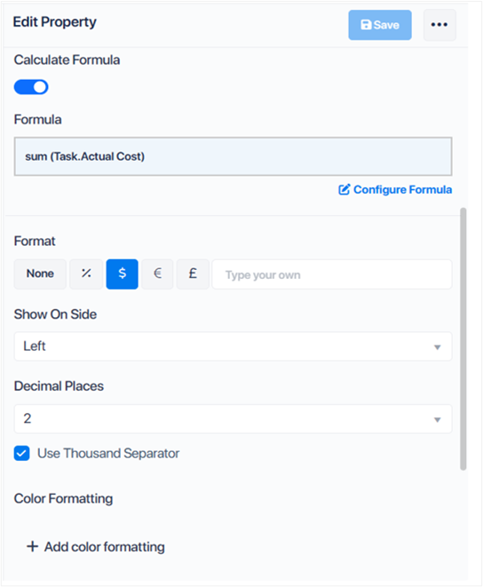
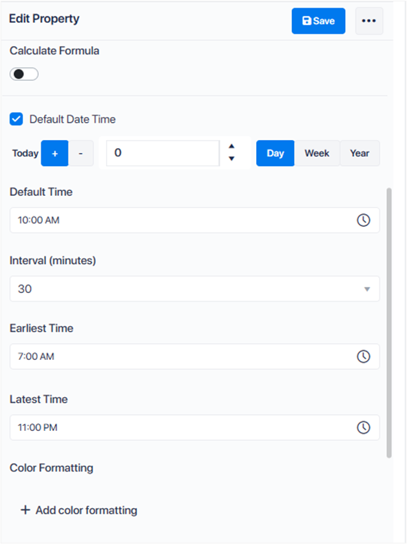
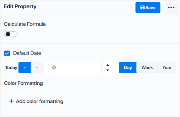
Calculate Formula: A toggle enabling the creation of a formula to calculate the property’s value.
Format: Determines the display format of the property value, with options for customization and the inclusion of a thousand separator.
Minimum Value: Sets the lowest allowable value for the numerical property.
Maximum Value: Establishes the highest allowable value, which cannot exceed 2,147,483,647.
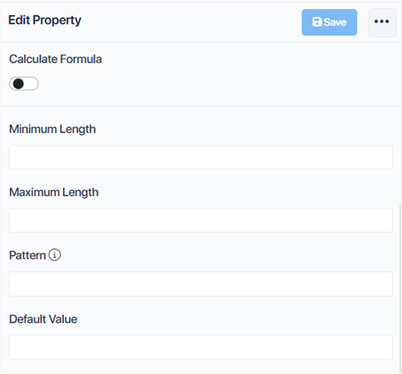
Minimum Length: Defines the minimum character count permitted in the property.
Color Formatting:
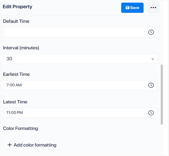
Adds color formatting to property values based on conditions.
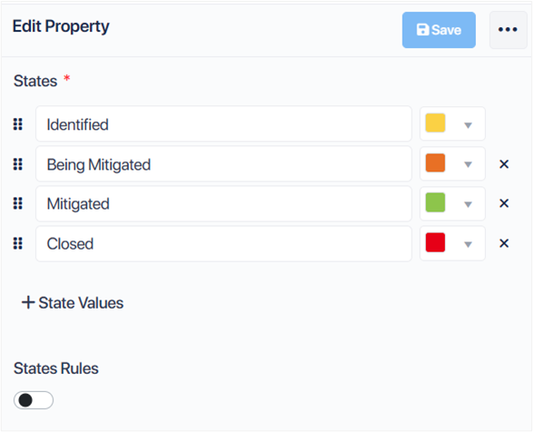
If Value Is: Specifies conditions for color changes in text or fill color.
Add Else Condition: Allows for additional conditional formatting.

Property Type: Dropdown

Dropdown Values
Additional dropdown options can be added by clicking the “+ Dropdown Values” button, enhancing the property’s versatility.
Default Value: Sets a pre-defined value for the property, automatically assigned to new records to ensure consistency.
Color Formatting: Initiate color formatting for property values by clicking “+ Add Color Formatting.
Specify conditions for changing the “Text Color” or “Fill Color” based on the property’s value.
Further conditions can be added through “+ Add Else Condition,” allowing for comprehensive visual differentiation.

Property Type: User Identity

Show Profile Picture: A checkbox that, when selected, enables the display of the user’s profile picture alongside the user identity.
Use Display Name: A checkbox allowing the use of the user’s display name in addition to their user identity, providing a more personalized touch.
Default Value: Sets a standard value for the property, automatically applied to all new records. The default setting is typically “Current User,” ensuring user-specific data is automatically associated with record creation.

Property Type: Date Time

Calculate Formula: A toggle button that enables the creation of a formula to calculate the property’s value.
Default Date Time: A checkbox that, when marked, sets a predefined date and time for new records, ensuring consistency and efficiency in data entry.
Interval (minutes): Specifies the time interval for scheduling within the application, facilitating precise timing for events or tasks.
Earliest and Latest Time: Allows setting constraints on the earliest and latest time values that can be assigned to the property, ensuring data validity and relevance.
Color Formatting: By clicking “+ Add Color Formatting,” you can define color changes for the property values based on specific conditions, enhancing visual cues and data interpretation. Additional conditional formatting options can be added through “+ Add Else Condition,” allowing for a nuanced presentation of data based on value thresholds.

Property Type: Date

Calculate Formula: A toggle button enabling the creation of formulas for property value calculations.
Default Date: A checkbox feature that, when activated, allows you to set a specific date which will automatically assigned when a new record created, facilitating uniformity and efficiency in data entry.
Color Formatting: By selecting “+ Add Color Formatting,” users can apply color changes to property values based on specified conditions, enhancing data visualization and user interface interaction. Additional conditional color formatting can be implemented by clicking “+ Add Else Condition.”

Property Type: Time

Calculate Formula: A toggle allowing the creation of formulas for the property value calculation.
Default Time: Sets a specific time automatically for new records, streamlining data entry and consistency.
Interval (minutes): Defines the time intervals for scheduling activities or reminders within the application, enhancing organizational efficiency.
Earliest and Latest Time: Establishes minimum and maximum time constraints for the property value, ensuring adherence to time-related requirements or restrictions.
Color Formatting: Initiate color coding for property values by clicking “+ Add Color Formatting,” offering visual differentiation based on specific conditions. Additional conditional formatting can be implemented through “+ Add Else Condition,” allowing for comprehensive customization of data presentation based on time values.

Property Type: Tree Dropdown Field

Tree Dropdown Values: Additional values can be added by clicking the “+” button, expanding the property’s utility and customization.
Default Value: Establishes a pre-set value for the property that is automatically attributed to all new records, facilitating consistency and efficiency.

Property Type: State Field

States: Additional state values can be incorporated by clicking the “+State Values” button, enhancing the property’s functionality.
State Rules: A toggle button enabling the definition of specific rules governing how the State field operates, ensuring process consistency and clarity.
Note: By Default, the state field is check marked as required. In order to save a record, this field must be selected.
After modifying your property as needed, you should proceed to save your changes by clicking the “Save” button.
To finalize the editing of properties, follow these steps:
Step 1: Update the Application
Find the Update Button: Navigate to the App Model page and locate the ‘Update App‘ button situated in the top right corner.
Step 2: Apply the Changes
Execute Updates: By clicking the ‘Update App’ button, you will incorporate the modifications into the workspace, guaranteeing that the alterations to the App Model are precisely mirrored in your actual workspace environment.
This article delivers a straightforward process for modifying application properties, emphasizing saving and updating changes to maintain app functionality and user satisfaction.