The Chart Designing feature allows users to create, customize, and visualize data through various types of charts, such as bar graphs, line charts, pie charts, and more. It provides intuitive drag-and-drop tools, and real-time data integration to enhance data representation. Charts satisfy the analytical needs of the users, making complex data more accessible and visually appealing. This feature is essential for business analytics, reporting, and presentations, enabling users to generate professional, insightful, and interactive charts effortlessly.
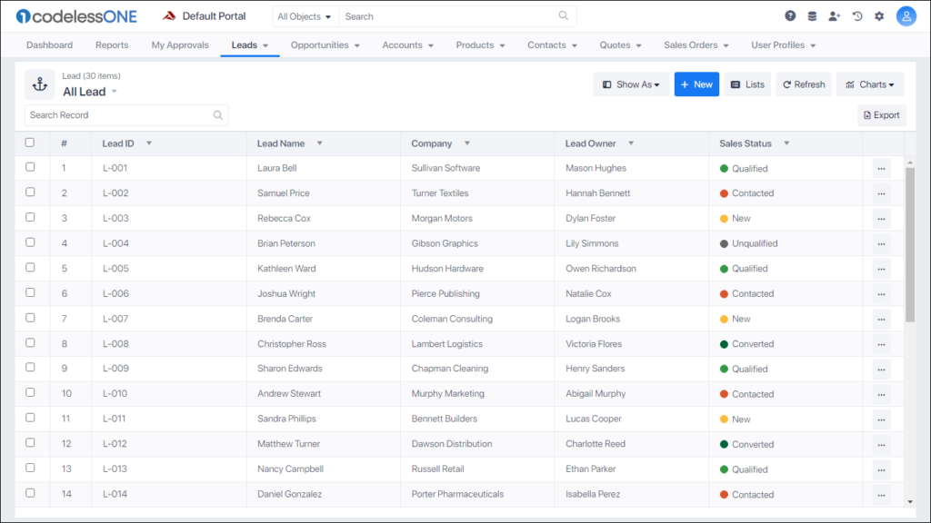
Open the relevant object in desired view (Table, Kanban etc.)
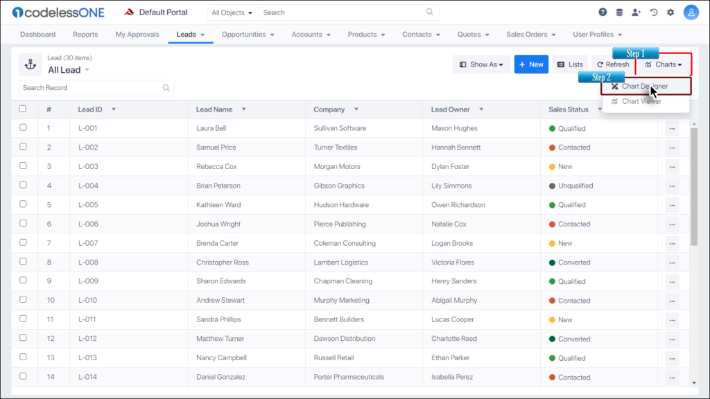
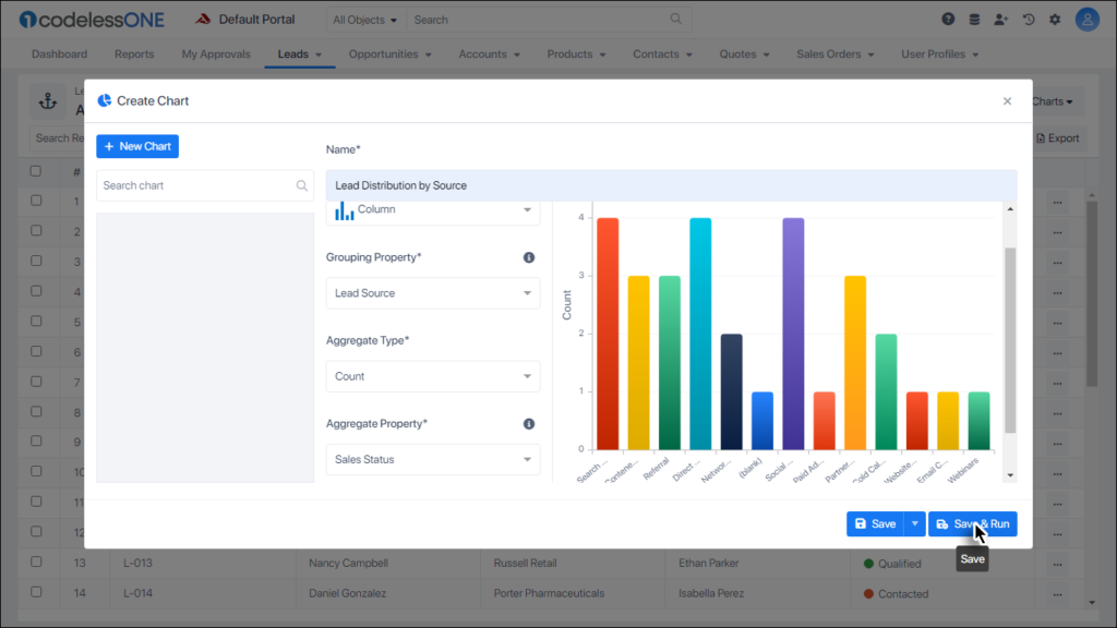
Click on the Chart button and then select the Chart Designer option.
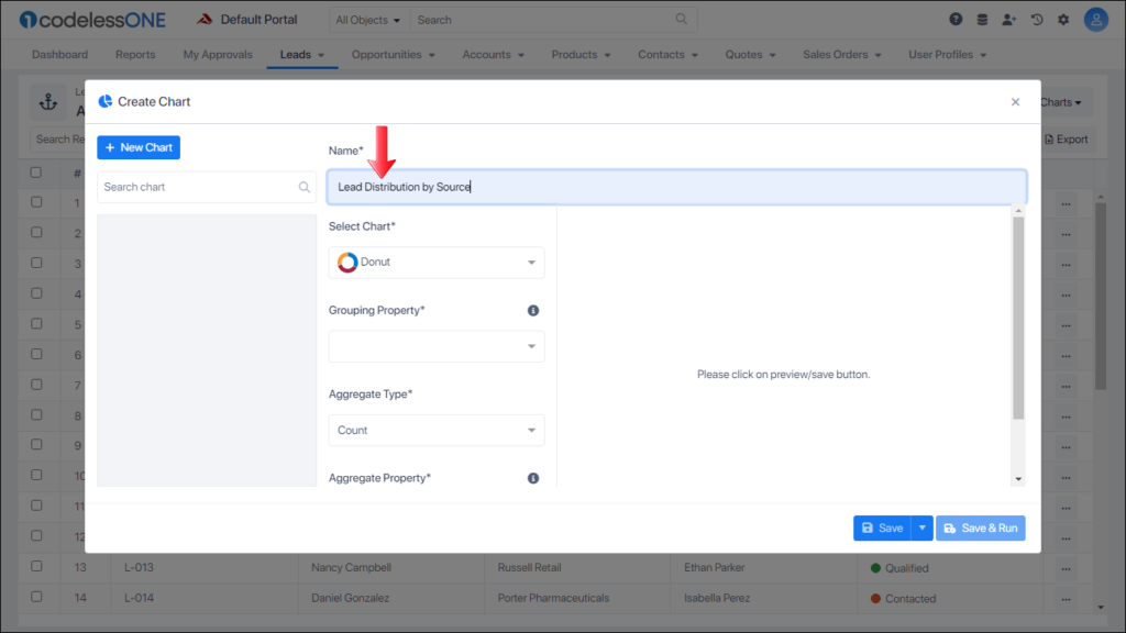
Give a suitable name to the chart being created.
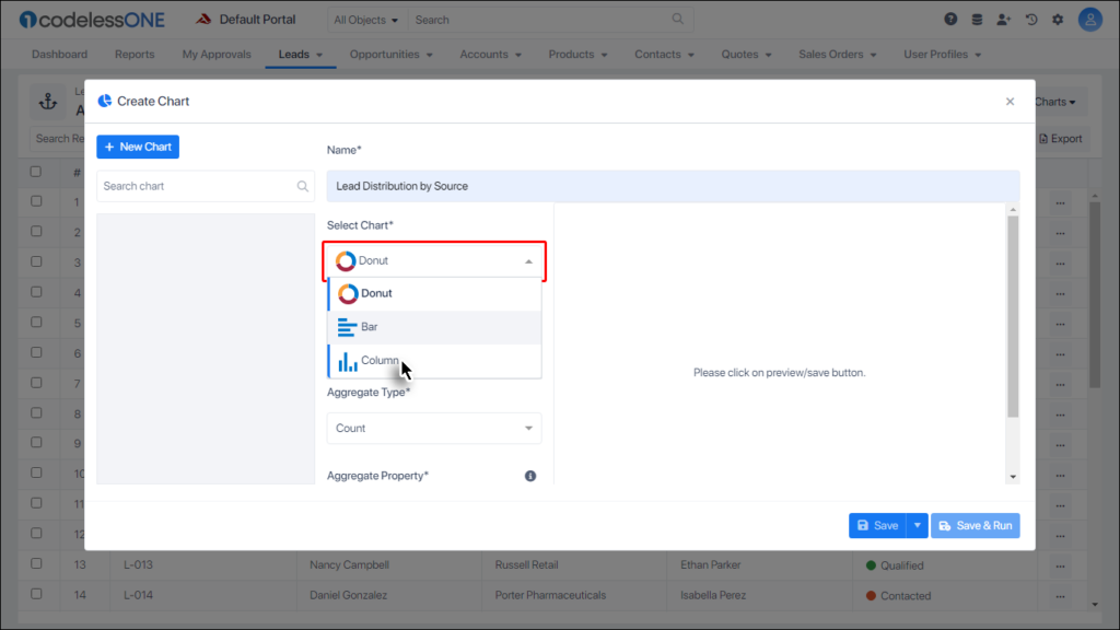
Select the desired chart type.
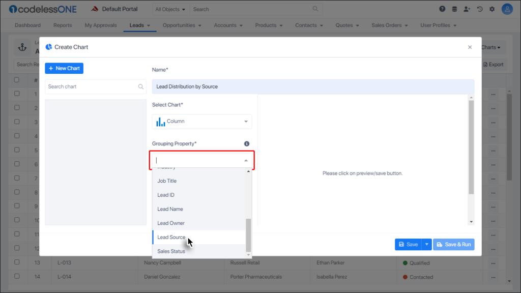
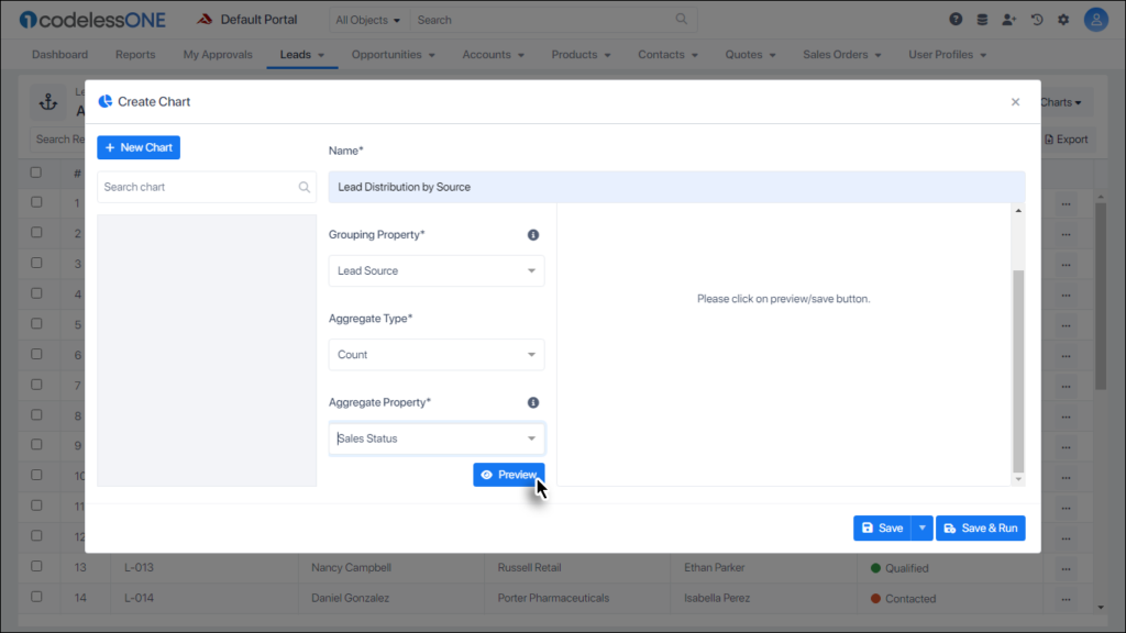
Select the desired Grouping Property.
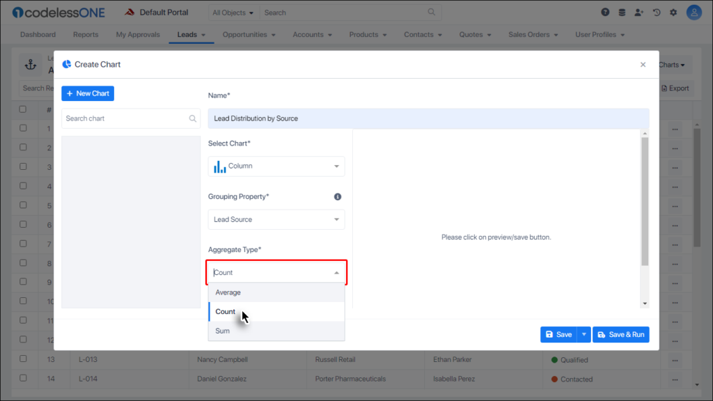
Select the desired Aggregate Type.
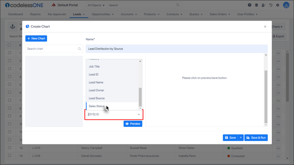
Select the desired Aggregate Property.
Click the Preview button.
If everything is as required then click the Save and Run button.
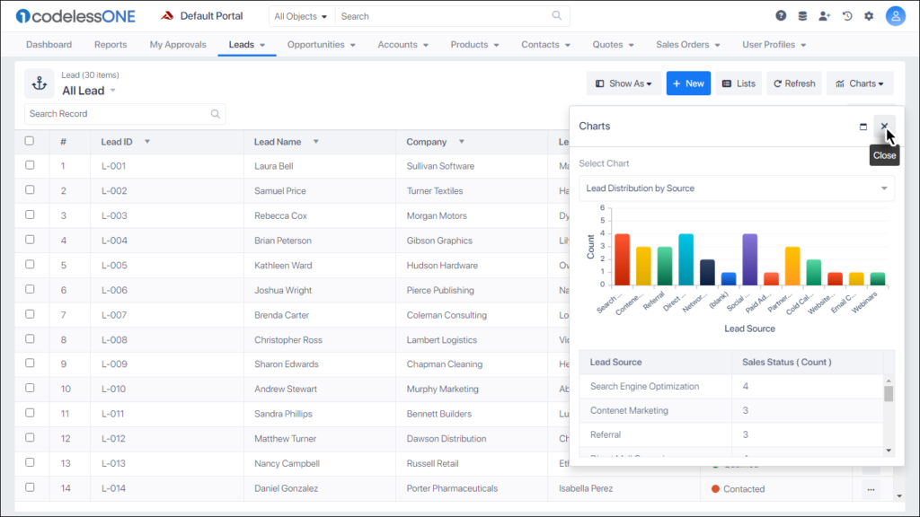
The chart is saved.
Click the close button.
Opening a chart
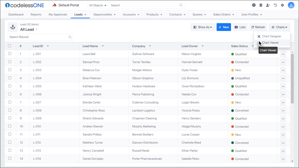
Now whenever a user wants to open the desired chart it can be done by using the following steps:
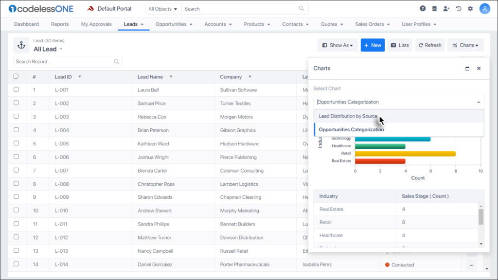
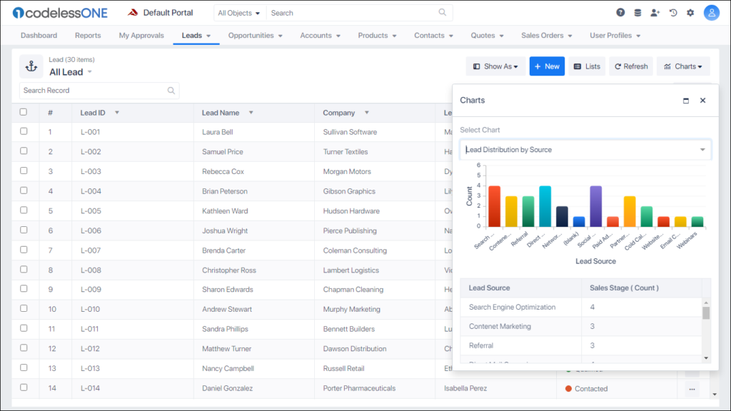
Click on the Chart button and then select the Chart Viewer option.
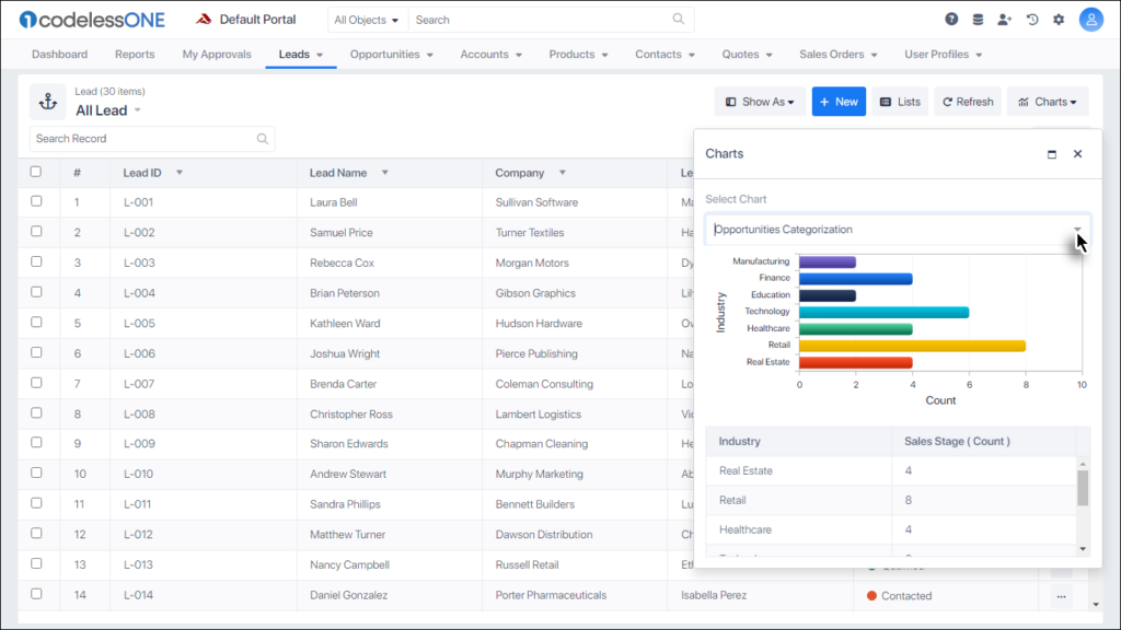
The chart viewer is displayed showing one of the charts created for the current object.
If the desired chart is not being displayed then click inside the Select Chart control.
Select the desired chart from the list.
The desired chart would be displayed.
Note: The Chart Viewer only shows the charts for the currently opened object. e.g. If a chart was created for the Opportunity object, it won’t show from the Leads object and vice versa. The user first needs to open the relevant object and then seek to view the desired chart.