To invoke the Inline Edit option, click on the App Settings icon and then on the On option.
The orange Edit icons appear on the editable section of the Page. Ignore the first Edit icon at the top as the Details View Page editing would be done using either of the 5 edit buttons highlighted below.
Click on one of the Edit icons.
The App Editor page appears with a dropdown control at the top. Selecting the relevant option users can edit the corresponding section of the Details View Page.
Editing Header section
The information shown in the header of the Details View page can be edited using the controls shown in the following image.
If the user wants to show/hide buttons (at the extreme-right) of the Header section, they can check/uncheck the relevant checkboxes.
Adding (or removing) attributes in the Summary section
Moving on to the Summary section, the property names in the table correspond to the attributes that are currently being shown in the Summary section. Users can add remove the attributes in the Summary section as elaborated below.
Click the Select Properties Button.
Enable/disable the relevant checkboxes to include/exclude a property in the Summary section, and then click the Select button.
Click the Update Page button.
The Summary section is updated.
Editing the Progress Bar section
The progress bar customization has the following options as elaborated in the image.
An object usually has just one status-type property. If there’s only one, the first dropdown will only show that property. However, if the object has multiple status-type properties, users can choose which one to use for the progress bar.
The progress bar can be labeled (if desired).
The most important configuration for the Progress Bar is whether to show it as discrete or progressive?
Editing the Details section
The Details section is where all the attributes’ details and other information are displayed, including linked attributes, attachments, discussions and history.
The contents of this section mainly depend upon which tab is selected.
Therefore, the editing of this section also depends upon the relevant selection in the dropdown at the top. When we need to do configurations for the Details tab, we need to select the relevant option, as shown in the following image.
To edit the label of the Details tab, select the Tab – Details option…
… and edit the label as desired.
Moving to the content part of the Details tab, the label of the attributes could be displayed at top, or at left.
If there are multiple sections within the Details section, then these could be set as collapsible or fixed.
If there are too many details to show, then users can opt to show them in steps. The checkboxes at the bottom are used to do that.
Tweaking the arrangement of tabs
The arrangement of tabs in the Details section can be invoked by either clicking the relevant edit button OR (if the App Editor is already open) by selecting the Tab Container option from the dropdown menu.
The current arrangement of the tabs is displayed.
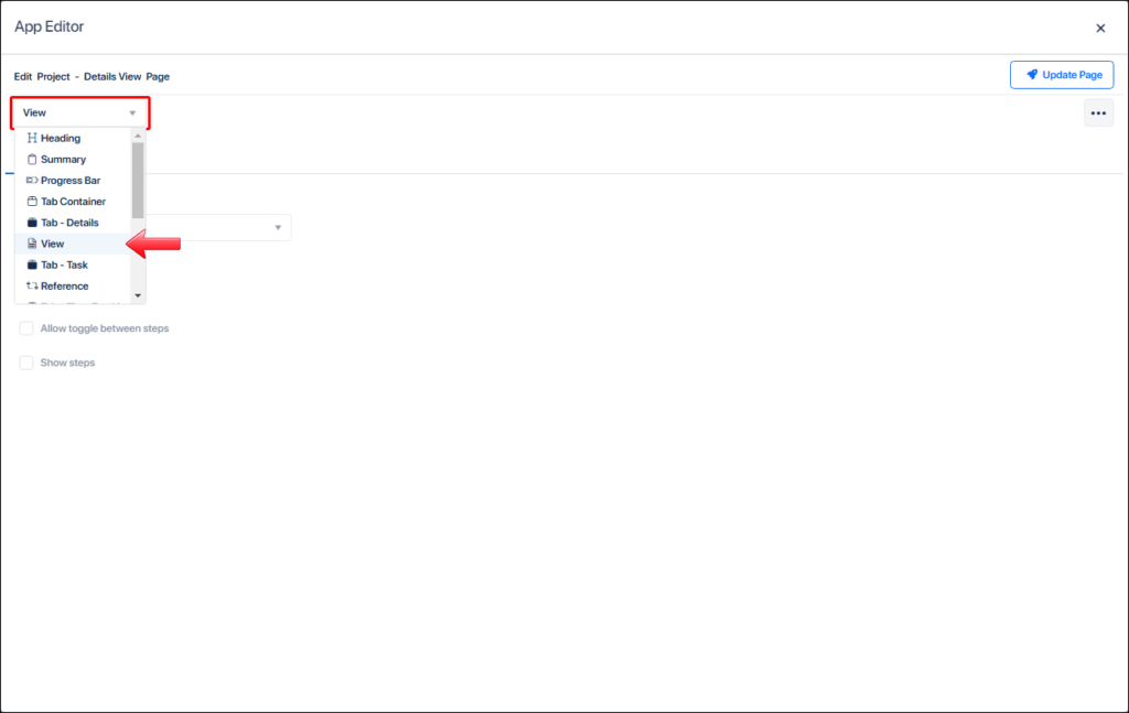
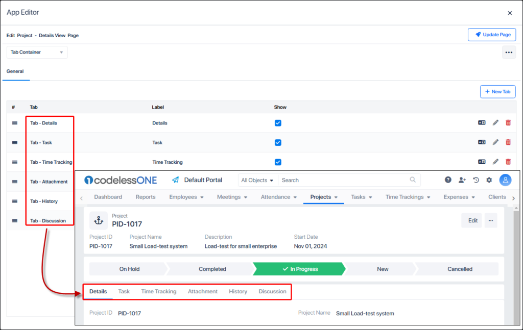
To change the order of the tabs, click on the left most icon against a tab’s name and move it to its desired position.
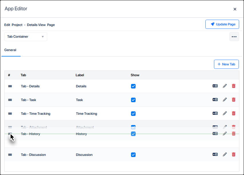
Disable the checkbox to temporarily hide the relevant tab, OR use the delete icon to remove it altogether.
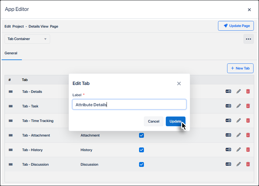
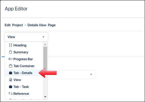
Clicking the Edit Tab icon invokes the tab rename box, where users can rename the tab as desired.