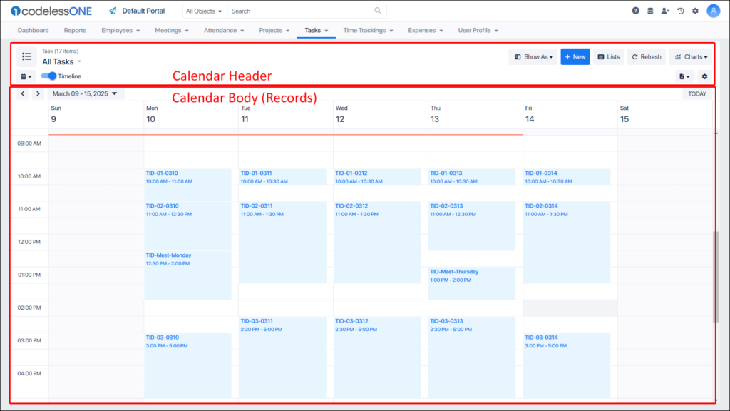
The layout of the Calendar View can be divided into header and body (Calendar section) in the most basic way.
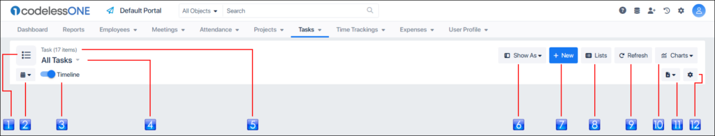
The Header section has the most controls as elaborated in the following image.
Icon: Icon of the object. Users can change this icon through the App Model
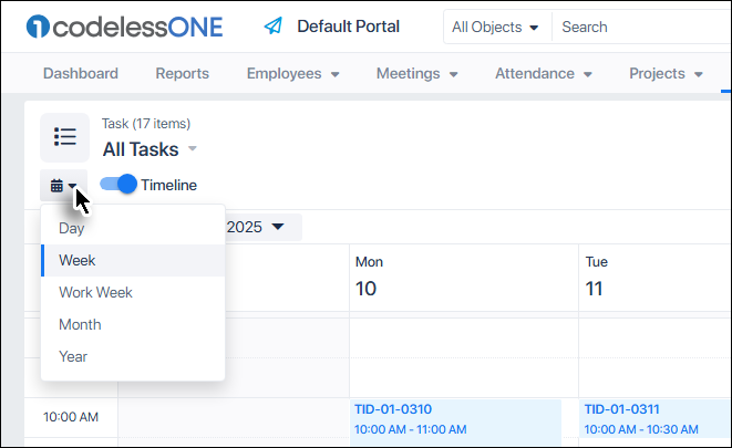
Calendar Type: Used to select desired type of the calendar
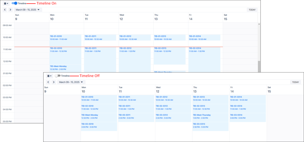
Timeline: Toggles the timeline on or off
List Label: Shows whether all records are shown or a list is being shown. Also used to create new lists in the current object
Object: Shows the current object and the number of records in the Calendar
Show As: Used to select the desired view for the current object
New: Used to add a record
Lists: Invokes List Designer
Refresh: Refreshes the table
Charts: Invokes the Chart Designer or Chart Viewer
Export: Exports the table as an Excel worksheet
Settings: Used for basic configurations of the calendar
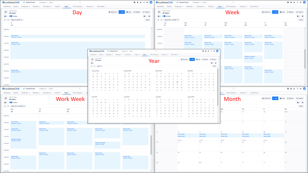
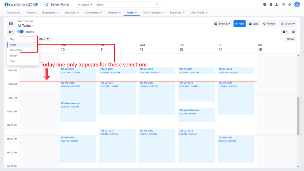
Using the Calendar Type control, users can select which type of calendar they want to see (and manage).
The following images show each type of calendar, supported by CodelessONE.
If the Timeline is toggled off, All time related information is concealed.
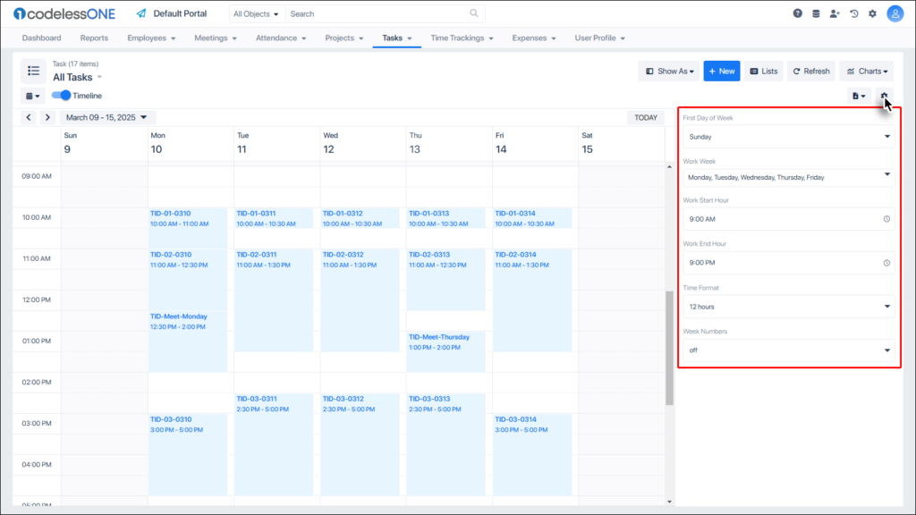
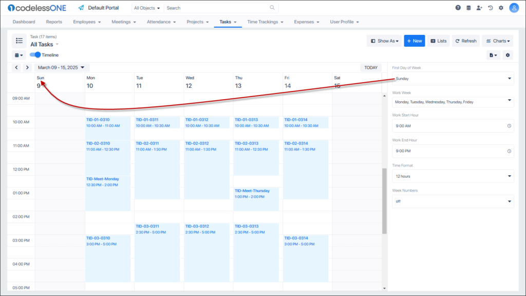
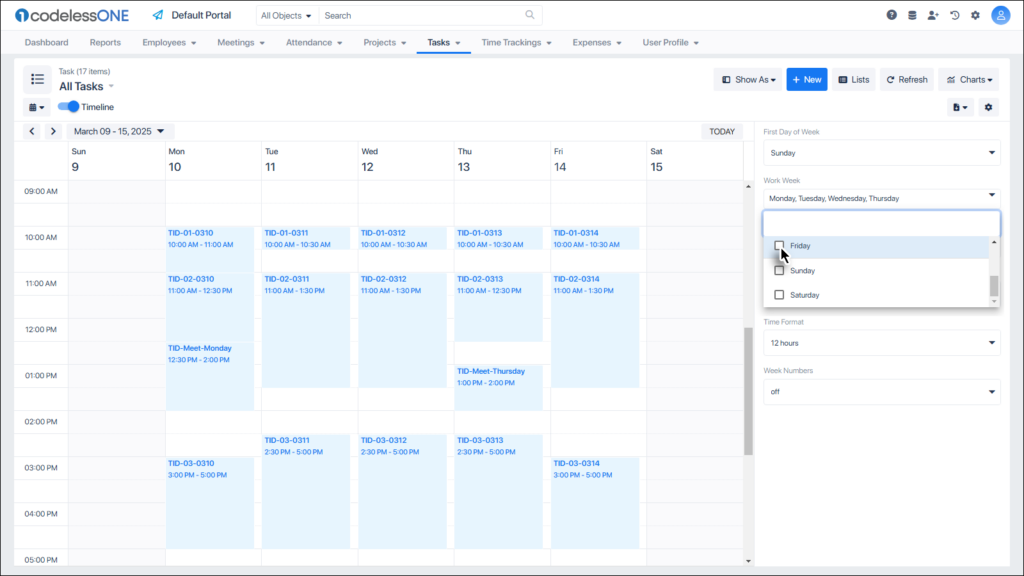
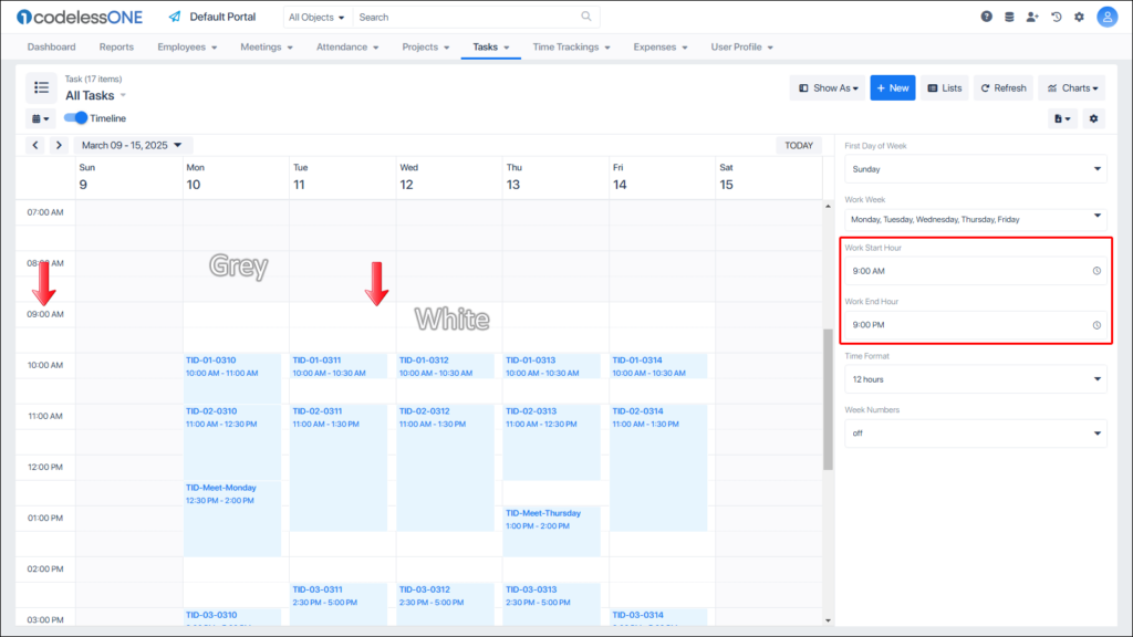
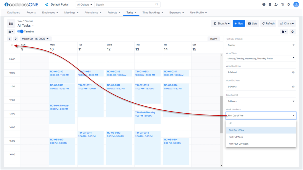
Clicking on the Settings button, shows the following configurations:
First Day of Week
Work Week
Work Start Hour
Work End Hour
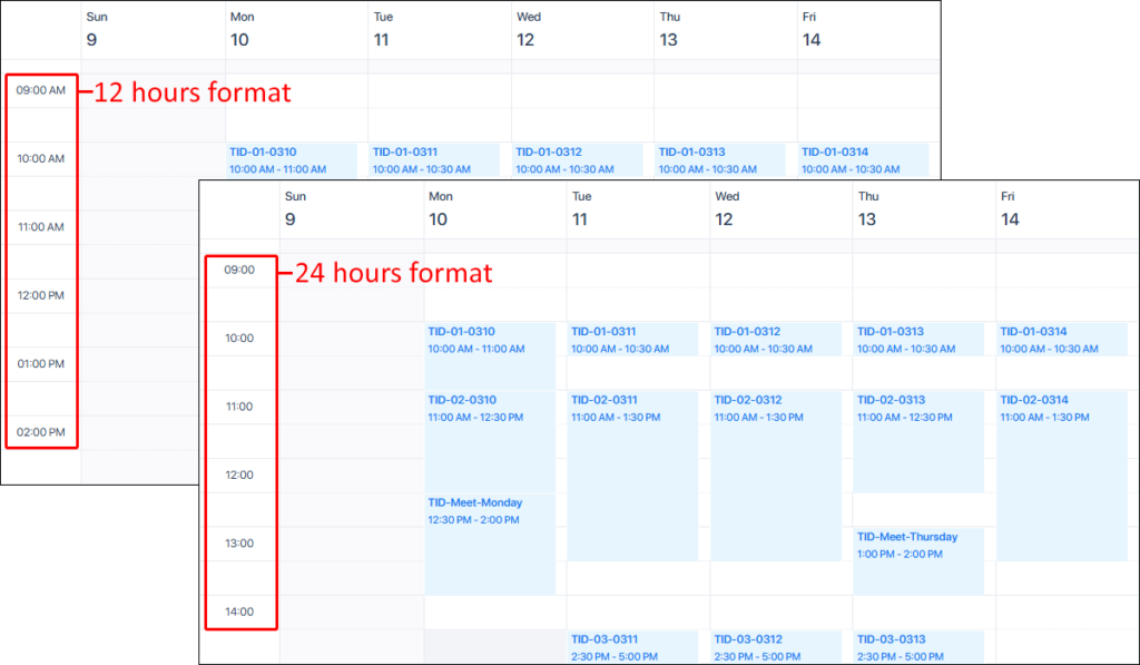
Time Format
Week Numbers
First Day of Week would be the one shown at the left most column in the calendar. Users can update it according to their work environment.
Using the Work Week option, users can set how many, and which days comprise of the work week in the organization.
The Work Start Hour and Work End Hour settings are quite obvious. Visually, CodelessONE differentiates between Working hours and off hours using different colors in the timeline.
The Time Format can be set as 12 hours or 24 hours.
Week numbers can be displayed on the timeline (if desired).
The Today line only appears for the Day or Week views.
For month and year view, the current day is subtly highlighted.
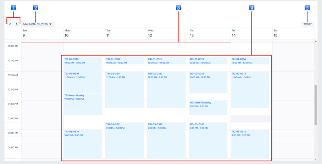
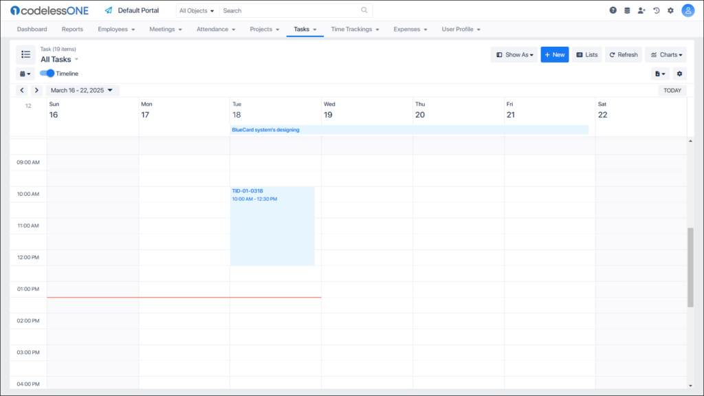
The Calendar Body section has the following controls.
Previous/Next Calendar Unit: Used to navigate to the desired calendar unit
Current Unit: Shows the label of the current unit
Today line: Highlights the current day
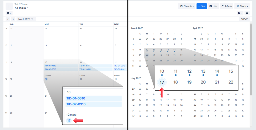
Records: Records of the object displayed as per their timeline
Today button: Bring the user to the current unit (in case the user had navigated to another unit)
If an activity spans a complete day or multiple days then it is shown at the top horizontally. If an activity ends/scheduled to end in few hours, then it is shown vertically under the relevant date.
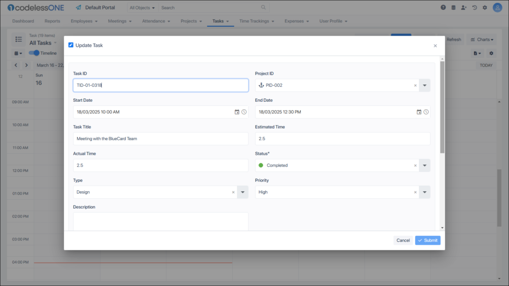
When a user double-clicks a record; it is opened in edit window.
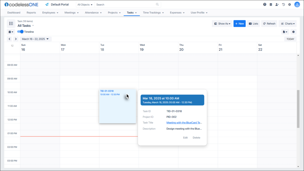
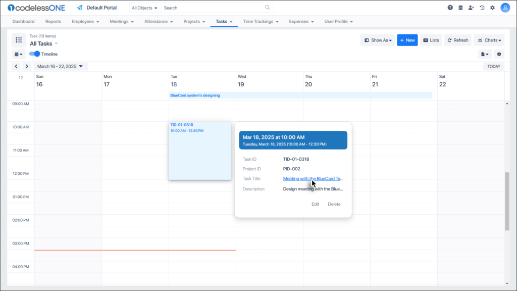
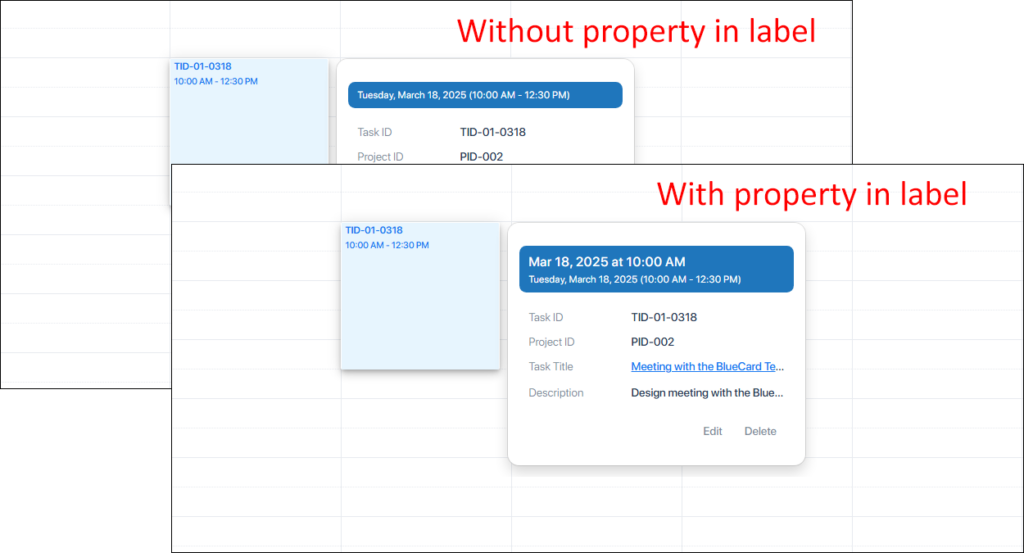
When a record is clicked (single-click) in the Calendar View, a flyover is displayed showing key attributes of the record.
Clicking the Record’s title in the flyover opens the record’s Detail Page.
Users can also edit/delete the record using relevant options from this flyover.