The Kanban View is one of the Object views available in CodelessONE. The view is based on Kanban cards categorized by the desired criteria. The criteria could be any property of the type:
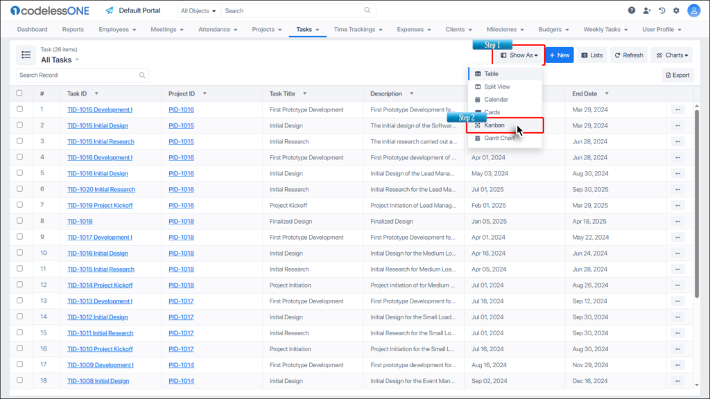
Click on the Show As button and then select the Kanban option.
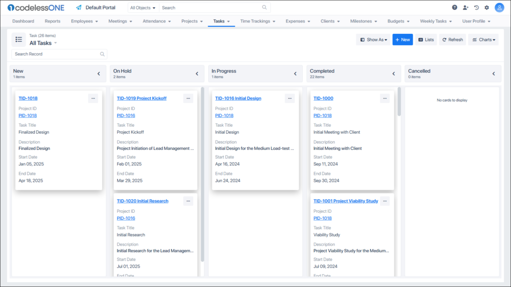
The Object is now displayed in the Kanban View.
UI
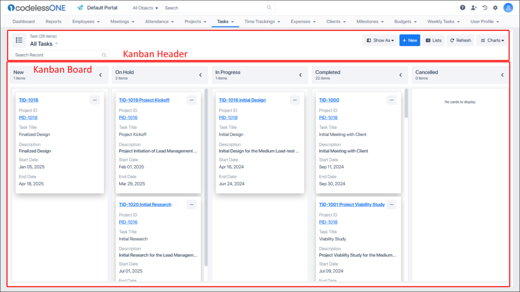
The layout of the Kanban View can be divided into header and Kanban board (Cards section) in the most basic way.
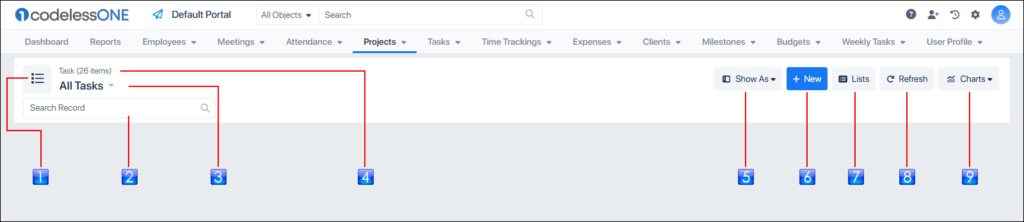
The Header section has the most controls as elaborated in the following image.
Icon
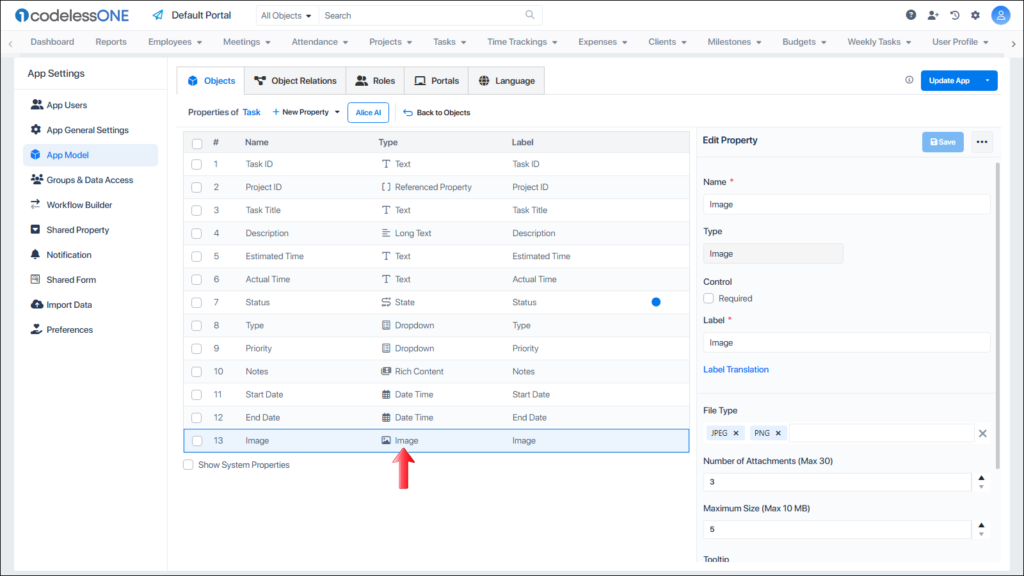
Icon of the object. Users can change this icon through the App Model
Search
Used to search for the desired card
List label
Shows whether all records are shown, or a list is being shown. Also used to create new lists in the current object
Object
Shows the current object and the number of records in the Kanban board
Show As
Used to select the desired view for the current object
New
Used to add a record
Lists
Invokes List Designer
Refresh
Used to refresh the Kanban Board
Charts
Invokes the Chart Designer or Chart Viewer
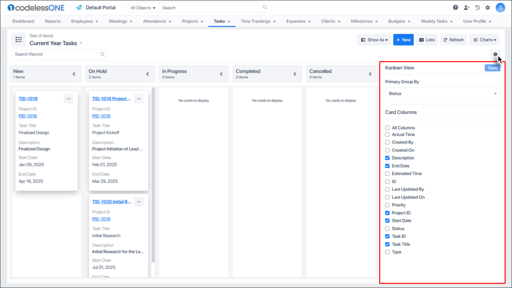
Settings
Used for basic configurations of the Kanban. This option is available only for the list created under the Kanban, not for the full object
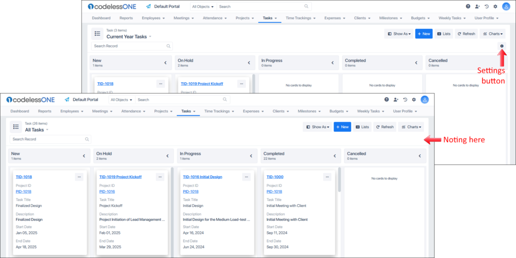
If a list is being shown instead of the full Object, then a Settings icon shows up in the Header section, as shown in the following image.
Clicking on the Settings button shows the Kanban View settings where users can apply basic settings to the Kanban Board.
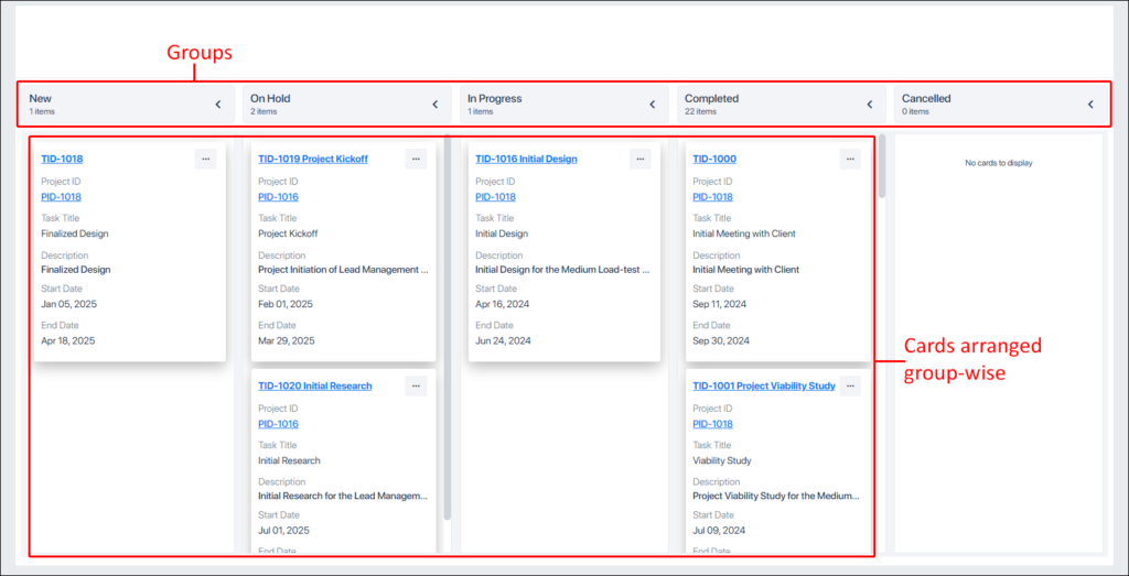
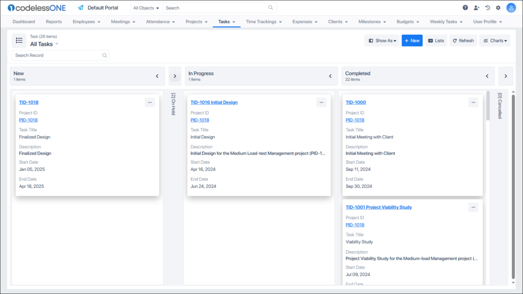
The Kanban Board is made up of columns, and each column contains cards that appear right below its header.
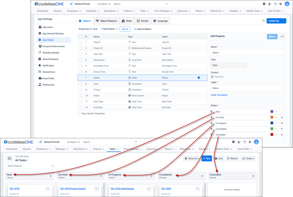
The columns are organized upon one of the properties of the object. As mentioned at the top, any of the following types of property can be selected to be the column header:
State
User Identity
Dropdown
Shared Dropdown
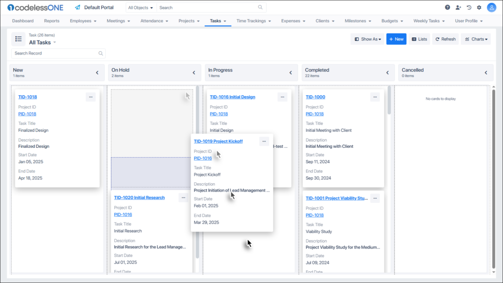
Take a look at the following image. The columns of this Kanban board are coming from the Status property of the Task object. The Status property is a state-type property.
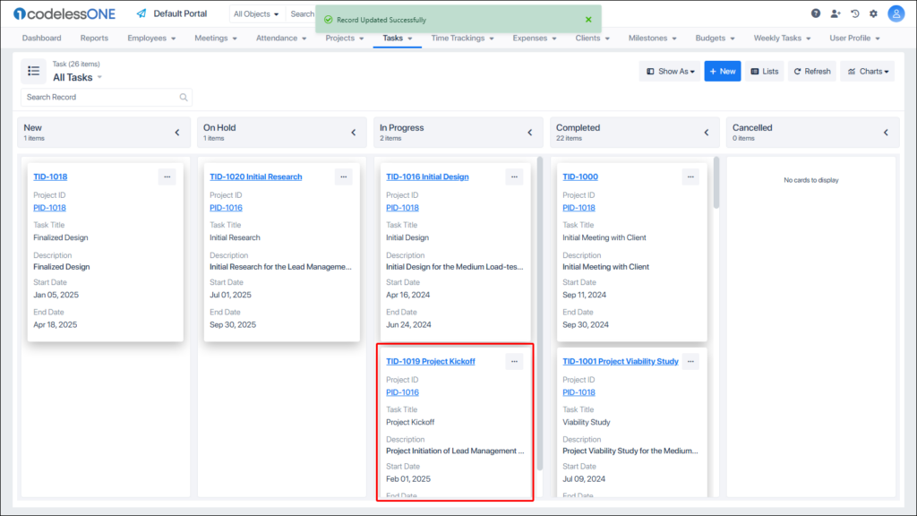
Users can drag and drop the cards from one column to another column of the Kanban Board.
This changes the value of the relevant property of the card, upon which the columns of the board are created.
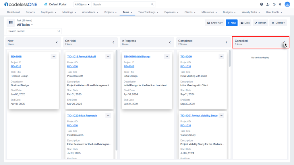
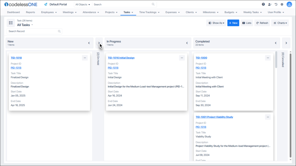
Arrows within the column headers are clickable.
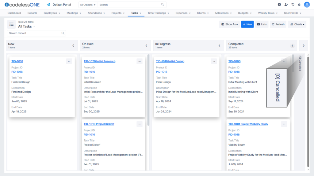
Clicking these arrows collapses the column.
Multiple columns can be collapsed on the Kanban Board.
The arrows work as a toggle button. Clicking on these again would restore the columns.
Instead of the whole page, the up/down scrolling is done for individual columns.
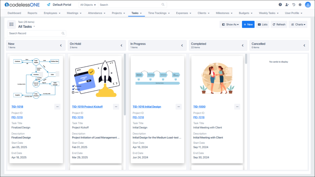
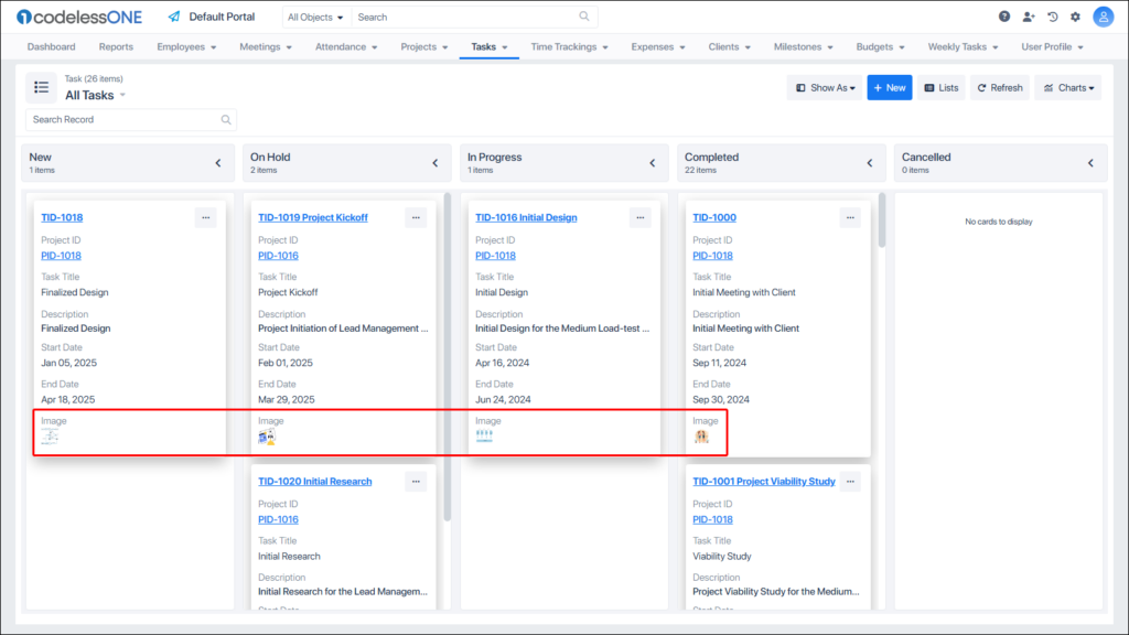
If an object supports an image-type property….
The attached images can be configured to show on the Kanban Board.
Instead of large images at the top of each card, their tiny thumbnails can also be shown.
Clicking on the thumbnail opens the relevant image in its full resolution. From this screen users can download the image, delete it, rotate it etc.